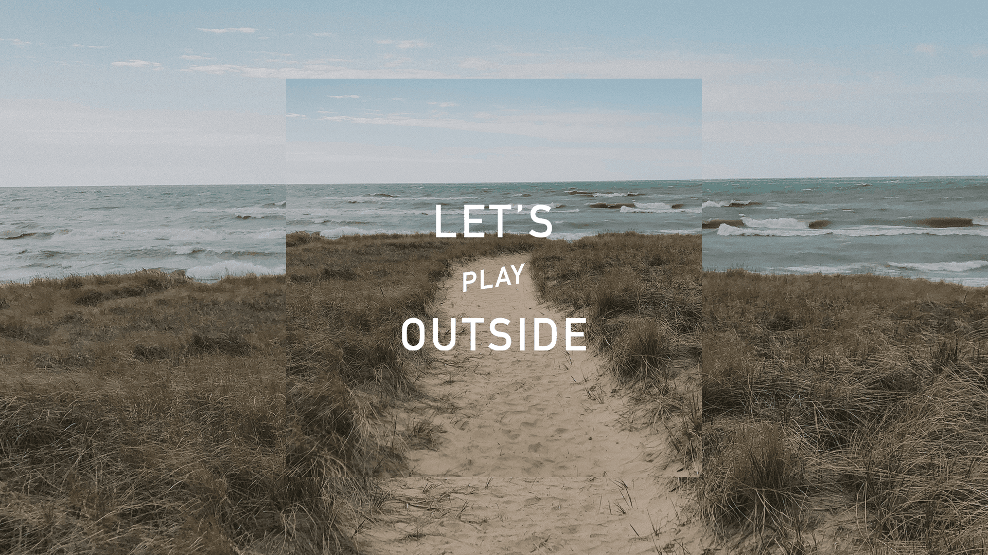
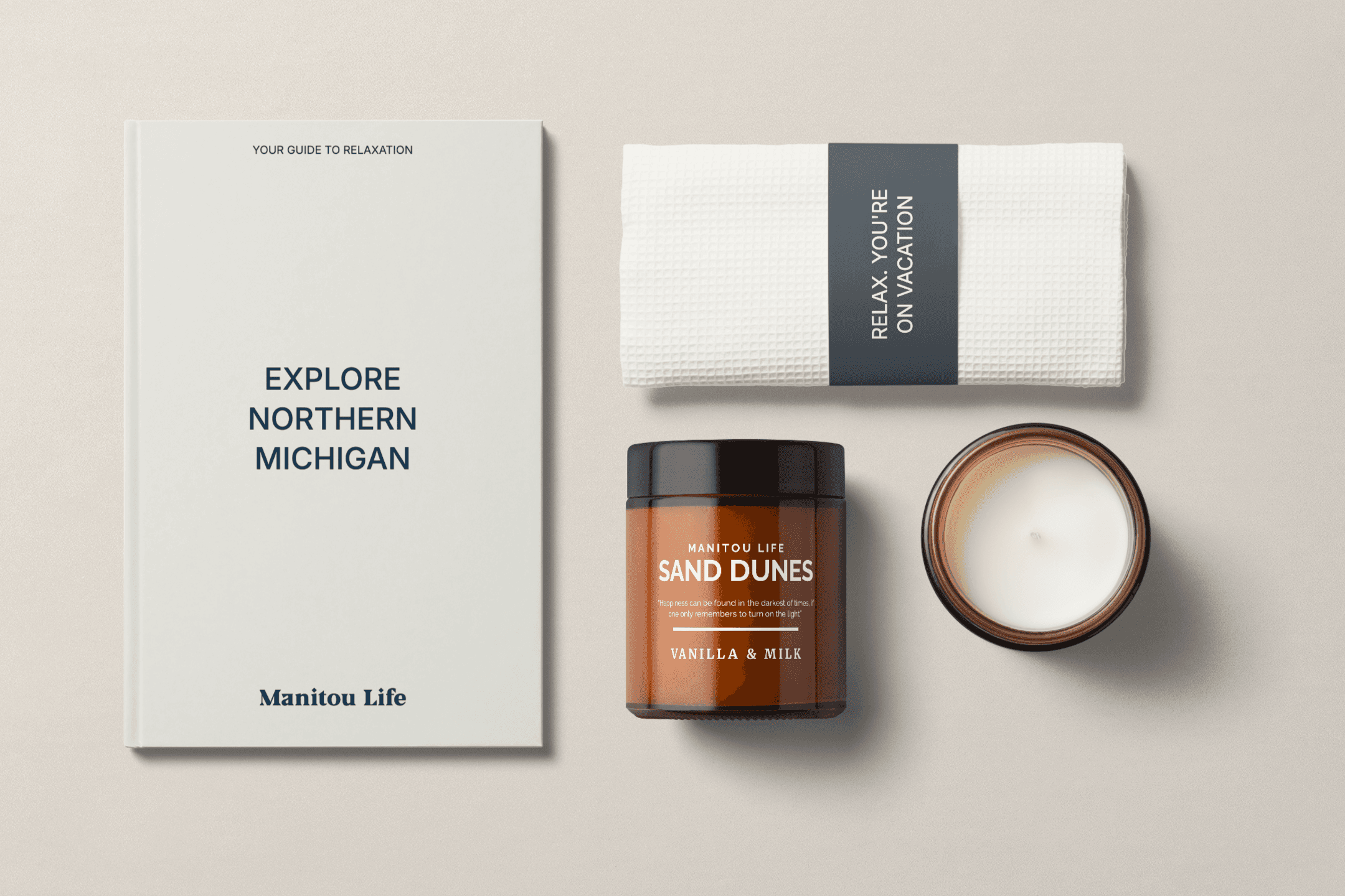
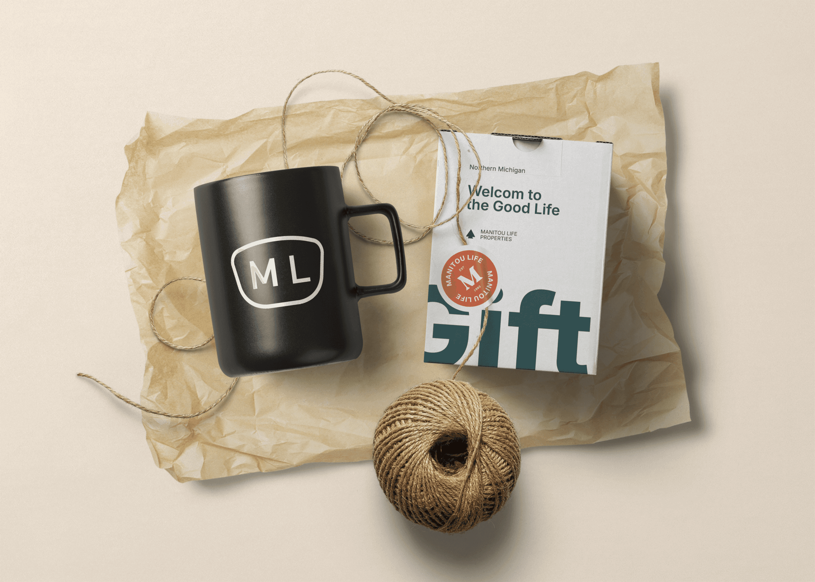
The Manitou Life identity lives in nature, simplicity, and quiet luxury. Inspired by the textures and tones of Northern Michigan, the visuals blend soft neutrals, warm earth tones, and clean, modern typography. The logo system nods to vintage outdoor badges while feeling fresh and refined. Photography captures authentic, slow-living moments, sun-drenched dunes, fireside evenings, and the subtle magic of time spent outside. We extended the system into tactile touchpoints like mugs, tote bags, and welcome gifts, creating a brand that feels lived in, thoughtful, and distinctly local.


Manitou Life is more than a property service—it’s a way of experiencing Northern Michigan. By clarifying their offer and building a brand that feels honest, elevated, and human, we helped create a system that speaks to both guests and property owners. The new identity adds a layer of care to every touchpoint and sets the stage for future growth, no matter where the brand expands next.
Next projects.
(2016-25©)